The Genesis framework defaults to a standard read more link which looks like [Read more...]. But what if you want to read Continue reading, Learn more, or whatever? What if you want it to be on a separate line in its own paragraph? What if you want it to look like a button instead of just a standard link? Well, then this lab is for you. In this lab, you will customize your Genesis child theme, any child theme, to fit your project’s needs. Yes, you will be doing all of these customization features.

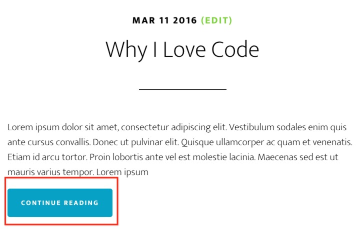
You’ll transform the default Genesis read more link from this:
![Default Genesis [Read more...] link](https://knowthecode.io/wp-content/uploads/2016/04/default-genesis-read-more-link.jpg)
to this:

Notice the following:
- The new version is one a separate line. You will be changing the HTML markup to wrap it in
ptags. - It has different text. You can change this to whatever you need in your project.
- It is styled like a button. As an option, you change your
style.cssfile to make it look like a button.
Works with Any Genesis Child Theme
In this lab, I’m using Altitude Pro. However, you can use any Genesis-powered child theme whether it’s from StudioPress, another theme supplier, or your own. It doesn’t matter.
This code and lab works on the following components within the Genesis framework:
- Posts Page (i.e. you know the Blog page)
- Archive pages, e.g. Author page, Categories, etc.
- Featured Post widget
Code. Eat. Code. Sleep. Dream about Code. Code.
Episodes
Total Lab Runtime: 01:27:22
- 1 Lab Introductionfree 04:20
- 2 Basic Code Overviewbasic 06:34
- 3 Markup & Code Setuppro 09:13
- 4 Let's Look at Genesis' Codepro 11:09
- 5 Let's Customize the HTML Markuppro 11:35
- 6 Change "[Read more..]" Textpro 09:39
- 7 Get Rid of the Dots Before the "[Read more...]"pro 13:24
- 8 Style Like a Buttonpro 05:44
- 9 Clean Up the Codepro 03:41
- 10 Handling the Read More When There is No Content Limitpro 12:03

